Examples / AI
How do you diagram a Cloudflare Workers architecture?
Updated
Browser -> Pages -> Workers -> |KV, R2, D1| and Workers -> Browser. Pages, Workers, KV, R2 and D1 each have a Cloudflare icon, and the bars make the three stores a choice, so each pass of the animation sends the request to a different one, KV on the first pass, R2 on the second, D1 on the third. The return line plays after the request has landed and goes back through Pages rather than straight to the browser.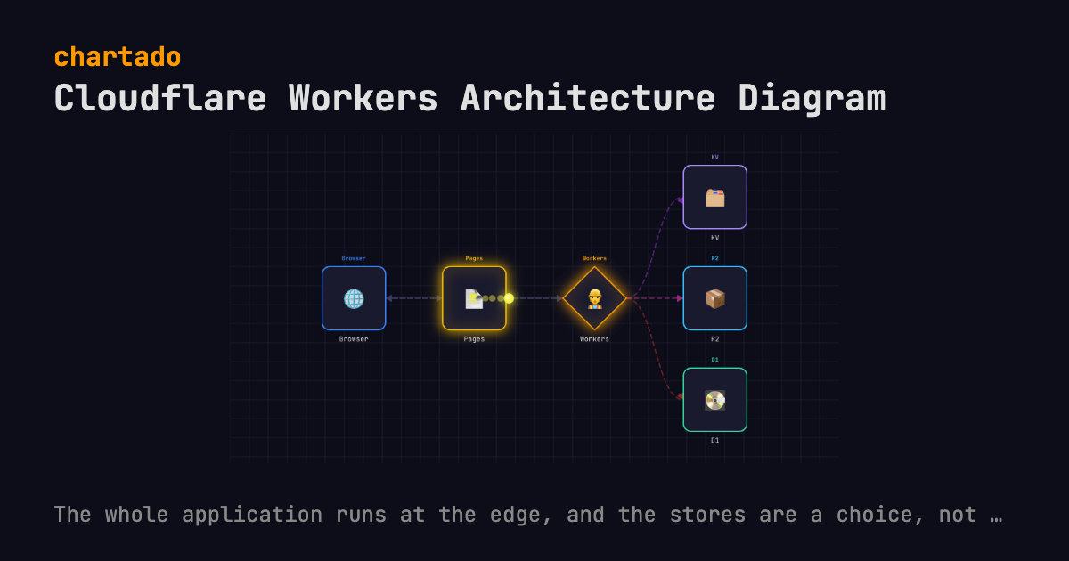
THE TEXT THAT DRAWS IT
Browser -> Pages -> Workers -> |KV, R2, D1|
Workers -> Browser
Edit it in the box above and the diagram redraws as you type. Export it as an animated GIF, WebM, WebP or MP4 video, or a still PNG or PDF, every format free. WebM and PNG export here; the rest are in the app after a free sign-up. Every format embeds this text, so the file can be read back into the editor.
WHAT IT SHOWS
This is a whole application on Cloudflare’s developer platform. Your Browser loads the static half from Pages, the dynamic half runs in Workers, and each request reads one of three stores, KV for key-value lookups, R2 for objects, D1 for SQL.
Bars carry the claim. A Worker does not fan out to every store on every request, it reads the one that request needs, and |KV, R2, D1| says exactly that. Run the animation for three passes and you get KV, then R2, then D1. Write braces there instead and all three light on every pass, which overstates what a request costs.
Workers -> Browser is the reply, and it is a second flow. Chartado looks up the forward route and plays it backwards one hop at a time, so the message goes Workers to Pages, then Pages to Browser, after the outbound pass has finished and a half-second pause. No long arrow home.
Geography is what it cannot show. Real Workers run in hundreds of locations and every box here exists once. What the animation shows is the request’s order, and it says nothing about distance, so if the reason you picked Cloudflare is the map, this will not draw the map.
Two more boxes were left out on purpose. Both a Durable Object coordinating stateful work and a Cloudflare Tunnel reaching back into private infrastructure have icons, and both draw. They are missing because this page shows the request path of the common case, which is stateless.
QUESTIONS
- Why are KV, R2 and D1 a choice rather than a broadcast?
- Because one request reads one store. Braces would send every request to all three, which overstates what a request costs. The
|KV, R2, D1|choice sends each pass of the animation to one store and moves to the next store on the next pass. - Does Workers conflict with Lambda workers in the AWS icon set?
- No. The Cloudflare vocabulary is checked before the AWS one and it matches whole words, so
Workerson its own gets the Cloudflare icon.Lambda Workerhas no whole-word match in the Cloudflare list (the keyword is workers, with the s) and falls through to AWS, which matches Lambda.
Also on this site: Serverless REST API diagram, Pub/sub fan-out diagram, Queue worker diagram, Event pipeline diagram, RAG pipeline diagram, Multi-agent router diagram, ReAct tool-calling diagram, Human-in-the-loop diagram and MCP architecture diagram. See all 10 patterns.
Chartado is a text-to-diagram tool: you type lines like A -> B, it draws the architecture and animates the flow.